Sunday, November 16, 2008

Critique Feedback

Positive Feedback:
  • Great shadowing
  • Accurate colors mixed and used
  • Interesting setup
  • Good use of mainly primary colors
  • "I like the brightness of the yellow, mixed with the deep blue and red, of the apple."
  • Nice layering of objects (apple inside bowl)
Critical Feedback:
  • Work on the colors of objects in some parts
  • Work on the shape of objects
  • Work on making things look shiny (i.e. the bowl)
  • Make the bowl less white, but make it look more shiny
  • Not a lot of detail
  • Boring setup
  • Could have used more space, and moved the objects around more, and not concentrated to objects in one space
Progress:
  • The colors that were mixed look much smoother
  • The shadows of the objects make the objects look much rounder
  • There is space between the light and the dark in the shadows, it isn't just light --> dark with no space, there is an "intermediate color"
  • Didn't cut an objects off (cut off bottom of the bowl in White Objects Painting)

Why Oil Paint?

Oil Paint was invented in Italy and Greece.  It was invented in the 15th century.  When oil paint was first created, it was a mixture of different types of pigment, and egg.  Jan Van Eyck was very important in the development of oil paint.  He was one of the first people to mix oil paint with pigment.  When he used this medium, and people saw his paintings, they thought it was brilliant.  Oil paint trapped light, and the intensity of the colors and the pigment was much more then tempera paint.  He used this technique because he wanted to make his paintings look very realistic and oil paint helped him achieve this goal.  Unlike the tempera paint, which dried quickly, and was very "plasticky", oil paint dries quickly and makes it so that you can re-work painting, and sections of your painting so that you can have them reach ultimate perfection.  Also, you can paint over colors without losing the color completely behind it.  You can make oil paint thinner or thicker, depending on the mediums you mix in.  Oil paint is a very popular choice in mediums now because artists can re-work their painting numerous times, and you can completely paint over things, or thin the paint so that the color can still shine through another layer of paint.  Oil paint is a medium of perfection.

What Is A Portrait?

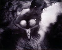
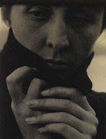
I think that a portrait is an idea, or an expression  about the artist.  I think that it doesn't have to be of a persons body or face, it could be a place, or a certain time, it is just relevant to the artist, and very specific to their life.  The artist is allowing people to view aspects of their life, and letting people into their life.  I think that a portrait is the most honest reflection of an artist.  In these three paintings/portraits, the artist has made the person painted very personal, and important.  There are few to no details in the background of the picture, and if there are any, they are there solely to enhance the person in the portrait.  The person that is being painted takes up almost the entire canvas, and they are the main focus.  There is nothing in the painting that the viewer could focus on besides the person in the painting.  Although these paintings are all trying to create the same message, that the painting is about the person focused on, they all take very different approaches.  In the first painting, the woman painted looks naked, and is not looking in the direction of the painter.  Also, the black and white gives the painting a very dark, and sad feel.  In the second picture, it is again in black and white, but it is more faded, giving the picture an older, or faded/historical feel.  The picture is up close, and quite personal feeling because of how close the viewer is to the persons face.  In the last painting, the woman is in a long, flowing black dress.  The painting feels very formal, and elegant.  Although these portraits differ in layout and design, the overall concept is clear: it is clearly focused on the person in the picture. 

1. Shiva At Whistle Creek
2. Georgia O'Keeffe by Alfred Stieglitz
3. Mdame X by John Singer Sargent

Tuesday, October 21, 2008

Where Are You At?

I can't believe it is midterm.  Ah.  I think that already i have really progressed in this class.  I have a much better understanding of how the paints with with each other, and much more of a keen eye for seeing color in different objects.  Over the course of the term, i think that the most challenging aspect for me has been to not judge my painting in the middle of when i am painting it.  I get very easily discouraged, and often times when i stand back to look at what i need to work on in the painting, i end up judging it, and come to the conclusion that "it sucks."  Clearly, that would be because it is no where near finished.  I think that it is important to be able to give yourself constructive criticism, and not have to feel like you can't finish the painting because it is so awful, when really, it is no where near done.  That is something that i really need to work on.  I think that i have progressed the most in seeing different colors in objects.  I find it more easy to now mix colors, and use them as shading and light and dark sides of objects.  I think that I am able to clearly tell what colors i need to add in order to make something lighter or darker, or shinier, or more dull, or warm or cool.  I am very proud of myself to be able to do that, and it is one of the principle ideas in art, and i feel like i have made a huge advancement in the right direction in understanding color in shadows, and shades and different objects.  Today, it is extremely important to look at painting from throughout history.  We are able to see how art has developed up until today, and how it is still developing, and will continue to develop.  It is interesting, and important to learn what advancement people made, and how they came to the idea or conclusion that they needed to be "updated."  I think that over the course of this term, I have really progressed.  Although i do need to be more consistent with my blog, i am very proud of the work that i have displayed.

Some Famous Paintings


Claude Monet was a founder of French Impressionist painting.  The painting "Water Lilies" changed the way that people viewed art, in terms of realism, and it as well changed the way that people made art, and approached art.  The point, or the intent of impressionist painting is to model the painting after the object that is seen, and being painted or drawn, but to not copy the object exactly.  In the painting, Monet used a lot of paint, and thick brushstrokes in order to get the painting to look like a pond with water lilies.  He used light blues and greens and browns, however, he did not paint exactly what was there, but he painted what the pond looked like in general, with a few of his own twists, and styles.  It is evident that in his painting, there is not as much detail, and intricate design as there would be in the real scene, and this was his idea, and his approach to how the painting should be painted, it was his "impression" of how he viewed the scene.  In the foreground of the picture, the water lilies are somewhat detailed and big, and then as the painting moves further back, the lilies get smaller, and the attention to detail is not as fine.  I think that this painting is very interesting, and very important to the history of art, because this painting was being painted in order to show the world that art was not just one idea, and that it was important to paint what you saw, along with personal style.  Monet helped define history with this painting.

White Objects Painting

Hooray.  My first "real" painting has been completed.  I think that overall, i did very well for my first painting, however, there are some things that i would change had i not been so stressed out, and done with it at the time.  I think that i really understand how to mix colors, and create light and dark shadows to make an object look round and have depth.  I think that my best example of that would be the bowl, on the bottom, as well at the roll of paper.  I think that i really mastered the light and dark portions of both of those objects.  I think that i would definitely go back and work on the yellow cloth in the back.  I think that i started to work on it, and i was not pleased on how it was coming out, and so i gave up.  I think that i could have mixed some darker colors, and put them on the paint, and then let it dry, and then lightly painted over it with the yellow, and it would have looked like the shadows and creases in the sheet.  I would have used mostly darker purples and blues for the shadows.  As well, i wish i had not cut off the bottom of the bowl, because it gives it an unpleasant "unfinished"/"cut-off" look that i am not so pleased with.  Overall, i am very proud of how well my painting turned out, adn all of the information that i gathered from painting it.

White Objects Painting (Thumbnail Sketches)

This is a picture of my three sketches for the White Objects Painting.  I chose to paint the one in the middle.